
Your site is already designed. Your job is simple: update content, swap images, embed videos, and duplicate sections when you need a new block. This guide shows you exactly how.
Best setup: Split your screen — Elementor on the left, this guide on the right. Two monitors is even better.
Time to complete: 45 to 90 minutes.
Start Here: How Elementor Is Organized
Elementor works in three levels:
- Container (the structure)
- Widget (the content: text, image, button, etc.)
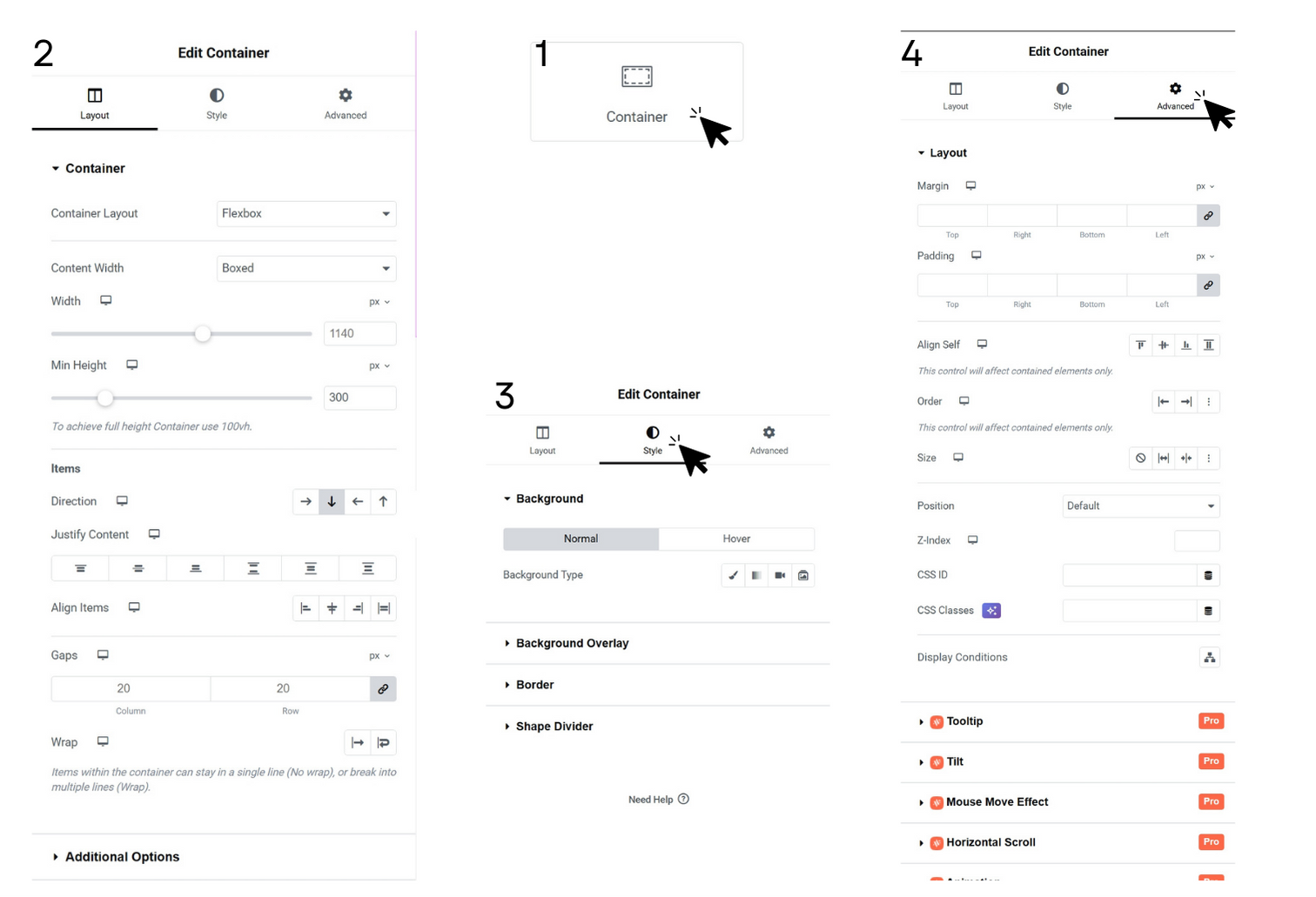
- Settings Tabs (Content / Style / Advanced)
If you remember nothing else, remember this:
- Containers hold widgets
- Widgets hold content
- Tabs control how it looks
Chapter 1 — Elementor (Free / Basic) — What You Need to Edit Content
If you’re using Elementor Free, everything below applies.
If you have Pro, you still need this chapter — it’s the foundation.
The 3 Tabs You’ll See on Almost Everything
When you click a widget or container, you’ll see:
Tab 1: Content
- The actual content (text, image, link, layout option)
Tab 2: Style
- Fonts, colors, spacing inside the widget, borders
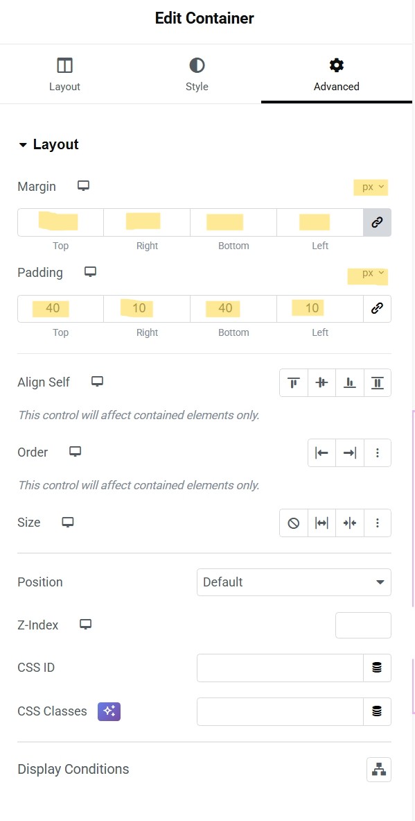
Tab 3: Advanced
- Margin/padding, responsive settings, motion effects (we’ll keep this basic)
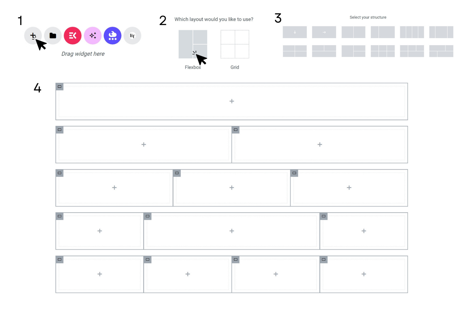
Containers (Layout) — The Only Part You Need to Understand
What a Container Is
A container is a layout block. Think of it like a row that can hold columns.
- You can place widgets inside it
- You can place containers inside containers (nested layout)
- Most modern Elementor builds use containers for everything
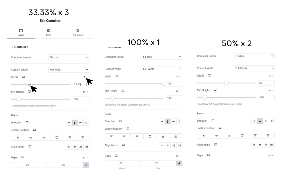
Container Width: Percentages vs Pixels (The Pro Rule)
This is where beginners get stuck — so here’s the clean rule that works:
Use percentages left-to-right (width)
Because your site must flex for phones, tablets, and desktops.
- 50% / 50% for two columns
- 33.33% / 33.33% / 33.33% for three columns
- 25% / 25% / 25% / 25% for four columns
Use pixels up-and-down (spacing)
Vertical rhythm should stay consistent.
- Padding top/bottom usually uses px
- Spacers are usually in px
- Section spacing usually in px
Quick default you can use safely:
- Section padding top/bottom: 60px desktop, 40px tablet, 25px mobile
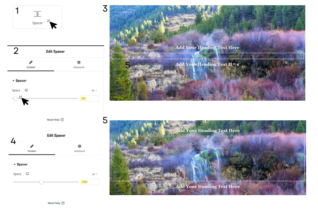
The #1 Layout Mistake: Using Spacer for Everything
Spacer is fine — but overusing it creates messy spacing on mobile.
Better approach:
Use container padding and widget margins first.
Use spacers only when you need very specific separation.
How to Build Common Column Layouts (Fast)
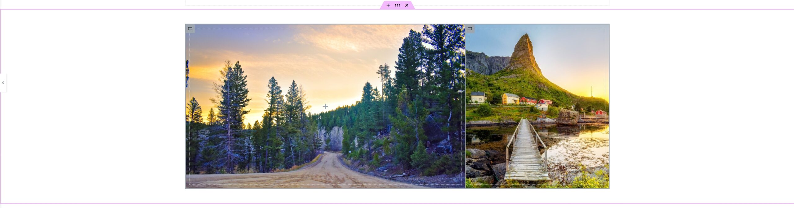
Two columns (50/50)
Use this for: text + image, two cards, side-by-side content.
Settings:
- Container direction: Row
- Child containers: 50% / 50%

Three columns (33.33 each)
Use this for: 3 features, 3 service blocks, 3 icons.
Settings:
- 33.33% each
- Gap: use “gap” instead of manual spacing when possible

“One big + one small” (66/33)
Use this for: main content + sidebar.
Settings:
- Left: 66%
- Right: 34%
Widget Basics (What You’ll Actually Use)
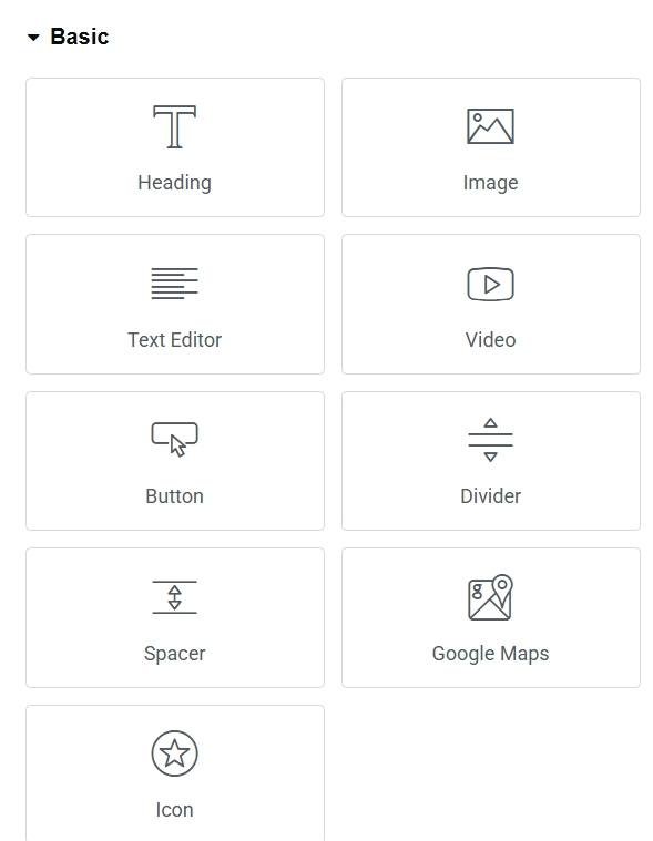
Heading
Use for: Titles and section headers.
Where to change: Content tab ? Title field.
Best practice:
- One main page title (H1)
- Section titles are usually H2
- Smaller headings are H3
Text Editor
Use for: Paragraph text.
Where to change: Content tab ? editor box.
Tip: Paste as plain text to avoid weird formatting.
Image
Use for: Swapping photos/logos.
Where to change: Content tab ? Choose Image.
Best practice:
- Use high quality
- Add alt text (for accessibility + SEO)
Video (YouTube Embed)
Use for: Tutorials, promos, walkthroughs.
Where to change: Content tab ? Link field ? paste YouTube URL.
Pro tip: Use the normal YouTube URL — Elementor handles the embed.
Button
Use for: Calls to action.
Where to change: Content tab ? Text + Link.
Best practice:
- Make button text action-based: “Contact Us”, “Get a Quote”, “Book Now”
Divider
Use for: Visual separation between sections.
Where to change: Style tab ? Width / Weight / Spacing.
Spacer
Use for: Controlled vertical whitespace.
Where to change: Content tab ? Space height.
Icons / Icon List
Use for: Feature lists that scan fast.
Where to change: Content tab ? icon + text.
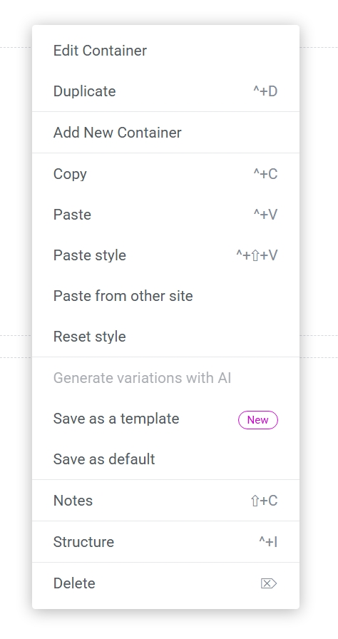
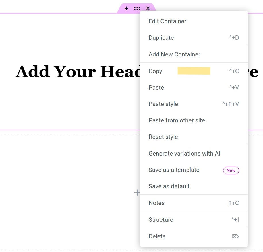
The Right-Click Menu (How Pros Work Fast)
This is where editing becomes quick.
When you right-click a widget/container, you’ll see options like:
Duplicate
Creates a copy directly below.
Best for: repeating blocks.
Copy / Paste
Moves content from one place to another.
Copy Style / Paste Style
Copies only the design settings (fonts, colors, spacing).
Best for: keeping consistency.
Save as Template
Saves a block so you can reuse it later.
Delete
Removes it (undo works).
Undo, History, and Revision Safety
Undo / Redo
Top left controls — use them freely. or keyboard shortcut (ctrl+z).
History Panel
Shows actions and lets you jump back.
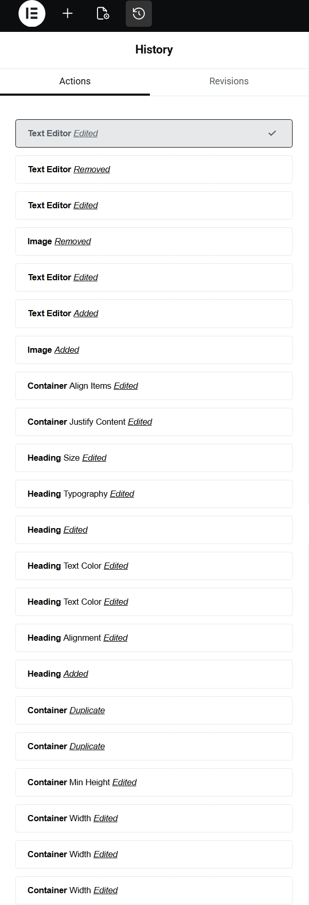
Reminder: You can’t “wreck” the page permanently if you know where History is.
Important: If you destroyed the layout do not publish it Just refresh your browser and hit leave anyway, once it reloads it will be back exactly how it was before you started editing. And you will lose all the edits you have done in that session.
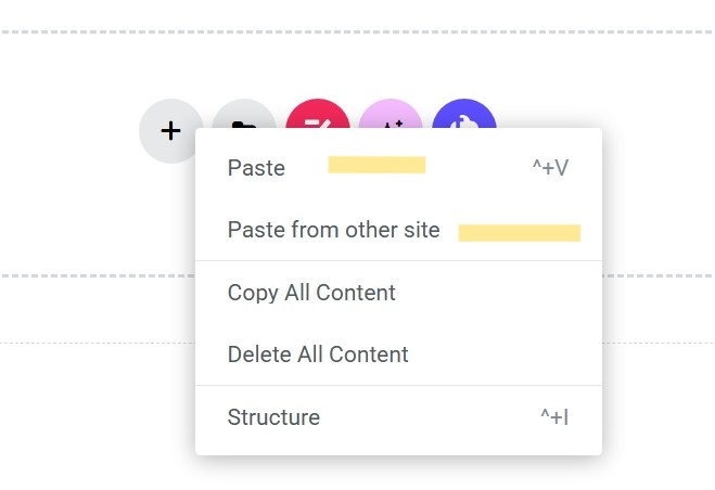
How to Copy Sections to Another Page (Client Favorite)
If you want the same layout on a new page:
- Right-click the container or anything you want to copy from one website or one page on your website to another.
- Copy
- Go to the other page ? Paste
Chapter 2 — Elementor Pro (Quick Overview)
If you don’t have Pro, skip this. If you do, these are the features you’ll care about most.
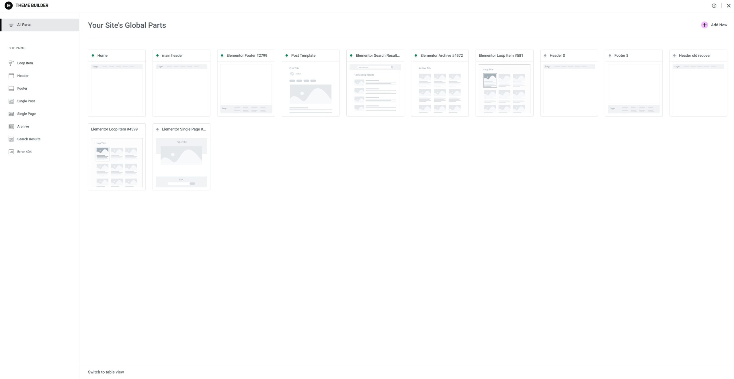
Theme Builder (Headers + Footers)
Pro lets you edit:
- Headers
- Footers
- Blog templates
Forms (No Extra Plugin Needed)
Pro forms can replace basic form plugins for most sites.
Loop Grid (Dynamic Blog / Listings)
Used for:
- blog post grids
- repeating layouts
Compass Production Note
If your website is built/managed by Compass Production, Elementor Pro is included in most plans — ask and I’ll confirm your license status.